In this session, we will learn to visualize data in R. Data visualization serves three primary purposes : data exploration, communication and aesthetics. First, when we have a new dataset and want to learn about the data, a few graphs can provide valuable insights into the distributions of variables (univariate plots) and their relationship with others (bivariate plots). Second, once we have analyzed our data and want to convery our findings, graphs can be highly effective to illustrate out argument. This notions is captured by the “A picture is worth a thousand words”. This is the case in research or having good visualization is usually better seen than using tables that are hard to read (Kastellec and Leoni 2007). But information in the public debate is also more and more visualized. This is more and more the case if you look at how graphs are more and mure used in the media to convey information. Think about the Covid and all of the graphs that emerged tracking the evolution of the pandemic or the popularity of a website such as World in data.
Furthermore, aesthetics play a significant role, and we appreciate visually pleasing graphs. R is capable of producing exceptionally beautiful graphs, and once you learn how to create them, you may develop a strong dislike for those who rely on Excel graphs for the rest of your life.
Furthermore, aesthetics play a significant role in data visualization, and we tend to appreciate visually pleasing graphs. R is capable of producing exceptionally beautiful graphs, and once you learn how to create them, you may develop a strong preference for R graphs over those generated by tools like Excel for the rest of your life.
10.1 Bad viz
At the same time, there many aspects on which we should care about when creating graphs. Most of the datavisualization we see in the media or in different reports are not great. So before to show you how to do graphs, here a few recommandations on what you should not do. According to Healy, graphs can be bad for three main reasons : perceptual, substantive and aesthetic.
There are three main ploting systems available for creating graphs in R. Base R provides functions such as plot(), hist() or boxplot() (you can also explore the lattice package). However, in this session, we will focus on a widely popular package called ggplot. It is a component of the tidyverse, so there is no need to install or load it separately if the tidyverse package is already loaded.
The “gg” in ggplot represents the “grammar of graphics” (Wilkinson 2012). Graphs are constructed by adding various layers to a basic graph, allowing for progressively more complex modifications such as adjusting the title or adding annotations.
To do a graph in ggplot, you need at least three things : data, aestethics and a geom.
Data : a dataframe, in a tidy format : observations as rows and variables as columns
Aesthetics : what are the values that we want to map on the x and y axis, with wich color/shape/size
Geoms : the geometry allows you to specify how you want to represent your data : geom_point(), geom_line().
It is not always easy to decide which graph is best at representing the information we want. You can have a look on the data to viz website or the R graph gallery which can help you doing this.
Other layers are also possible to add such as facets, statistics, coordinates and themes.
Graphs are built by adding these different layers with a + between each : it is additive syntax, here we do not use pipes. This might be quite abstract at this point but you will see how it works in a few minutes.
10.3 Exploring party politics with graphs
To learn about how to make graphs, we will use the Chapell Hill Expert Survey. I you are interested in political parties, it is definitely a dataset you should know. Basically, every 4 years, hundreds of experts in different countries are asked to locate political parties on different scales (eg : locating a party on a left-right scale from 0 to 10). The goal is to have an valid overview of where do parties stand in different issues on different countries. To use the data, I read directly the link of the CHES trend stata file that is available on the CHES’s website.
# Install and load packages with needs# You should install the needs package before with install.packages("needs")needs(tidyverse, ggrepel, gghighlight, ggridges, gganimate, labelled) # Load the CHES trend data : https://www.chesdata.eu/s/1999-2019_CHES_dataset_meansv3.dtaches <- haven::read_dta("data/ches.dta") |># Convert all of values to their stata labelsmutate_all(labelled::unlabelled) |>mutate(year =as.factor(year))colnames(ches)
n_distinct(ches$country) # How many different countries are there ?
[1] 28
n_distinct(ches$year) # How many different years (waves) ?
[1] 6
n_distinct(ches$party_id) # How many different parties ?
[1] 424
The dataset covers information on 424 different political parties, on 6 different waves and in 28 different countries. From the list of variables we can see that a few of them gives us variables on the year, the country, the party, its vote share and number of seats for a given wave and then a lot of variables on different issues.
For instance, I am interested in political parties’ preferences regarding the environment. There is two variables in the CHES for this : environment which measure parties’ environmental positions and enviro_salience which measures the salience of the environment for different parties.
10.4 Distributions
The first think we would like to know is how these variables are distributed. To do this we could first calculate some descriptive statistics.
summary(ches$environment)
   Min. 1st Qu.  Median    Mean 3rd Qu.    Max.    NA's
 0.2857  4.1456  5.5455  5.2001  6.6187  9.4000     502
summary(ches$enviro_salience)
   Min. 1st Qu.  Median    Mean 3rd Qu.    Max.    NA's
 0.7143  3.0000  4.2792  4.6009  5.8000 10.0000     746
The first thing we can see is that there are a lot of NAs. If you have not looked at the codebook carefully, you could wonder why. And this is because our dataset is composed with different waves at different years and the items we are interested are not available for all waves. One way to check it is to look at the mean by groups for different years. We see that for environment, we have values for 2010, 2014 and 2019, and for enviro_salience, only for 2010 and 2019.
ches |>group_by(year) |>summarise(# Compute the mean of environment salience for each yearenv_sal =mean(enviro_salience, na.rm = T),# Compute the mean of environment position for each yearenv_pos =mean(environment, na.rm = T) )
# A tibble: 6 × 3
  year  env_sal env_pos
  <fct>   <dbl>   <dbl>
1 1999   NaN     NaN
2 2002   NaN     NaN
3 2006   NaN     NaN
4 2010     4.48    5.16
5 2014   NaN       5.27
6 2019     4.70    5.16
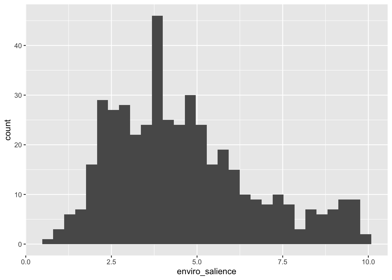
But we would have a better understanding of how the values are distributed with a visualization ! For this I create an histogram with ggplot.
# Dataches |># Aesthetics : what are the values we want in the plotggplot(aes(x = enviro_salience)) +# Geom : which kind of graphic do we wantgeom_histogram()
`stat_bin()` using `bins = 30`. Pick better value with `binwidth`.
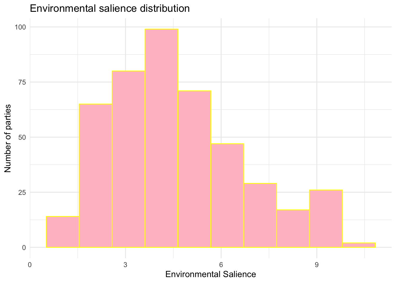
Note that then, this graph is highly customable with plenty of different arguments. Here an exemple of how it could change. Do not hesitate to change the values to see how it works.
ches |>ggplot(aes(x = enviro_salience)) +geom_histogram(bins =10, # alpha =1, fill ="pink", color ="yellow") +# Modify the axislabs(x ="Environmental Salience", y ="Number of parties") +# Change the theme of the graphtheme_minimal() +ggtitle("Environmental salience distribution")
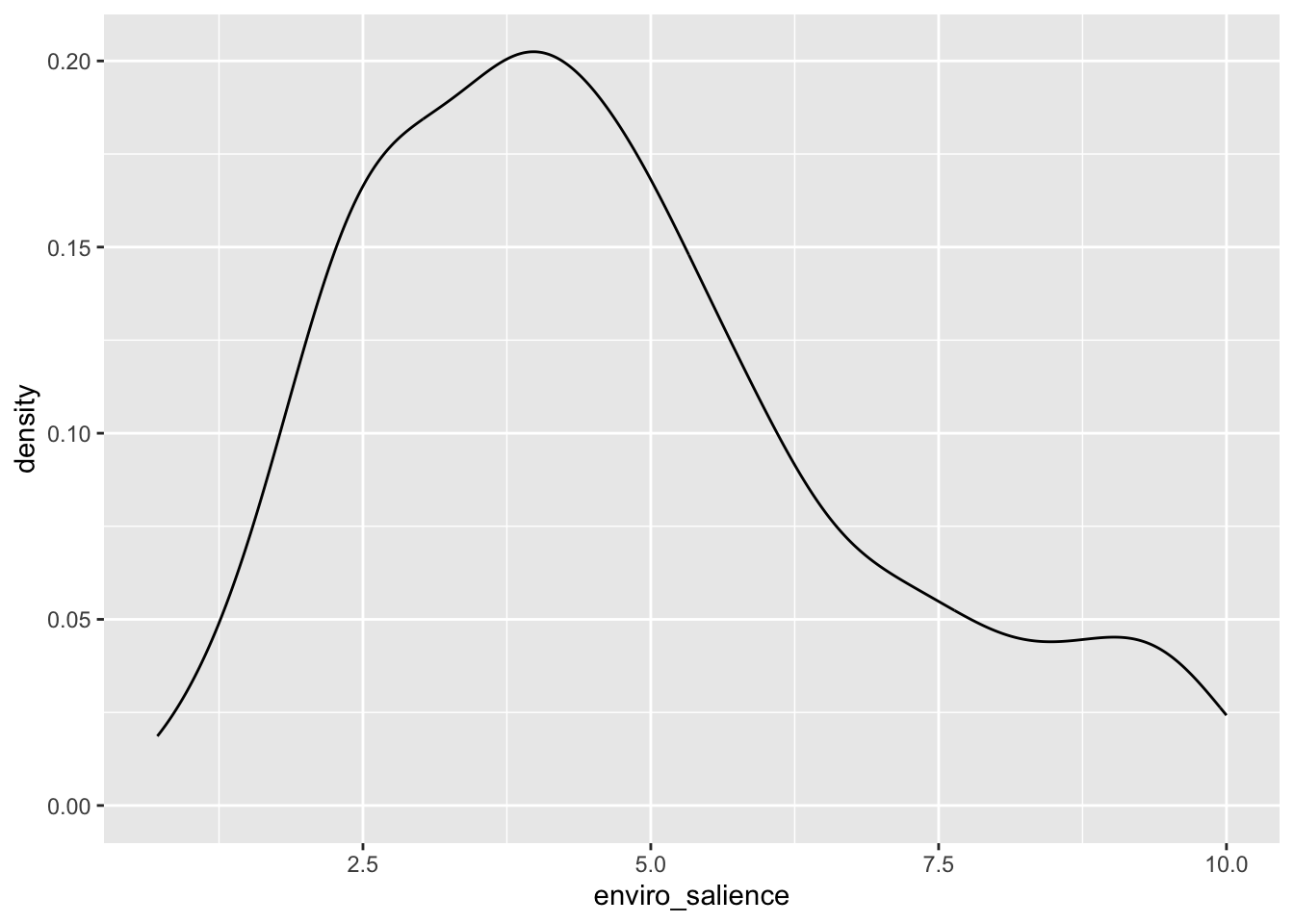
Another way to plot distributions is using geom_density() package. The “y” value at a specific point on the horizontal axis indicates the estimated probability density of the data at that point. In simpler terms, it tells you how likely data points are to occur around that particular value.
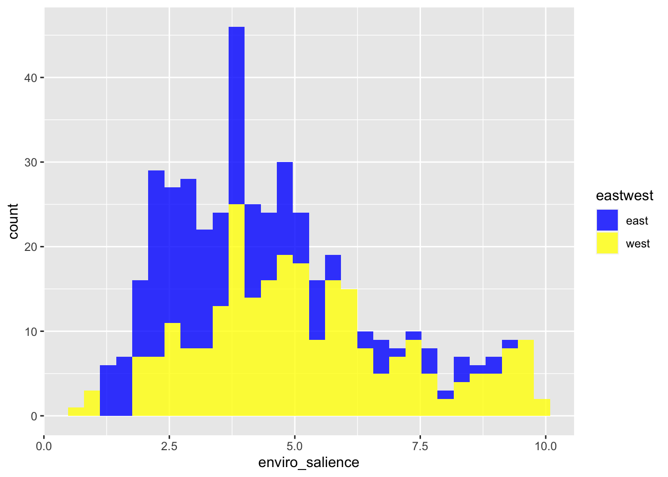
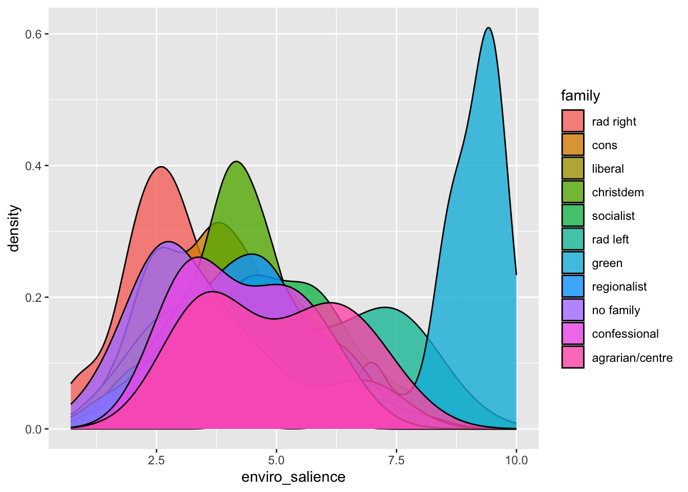
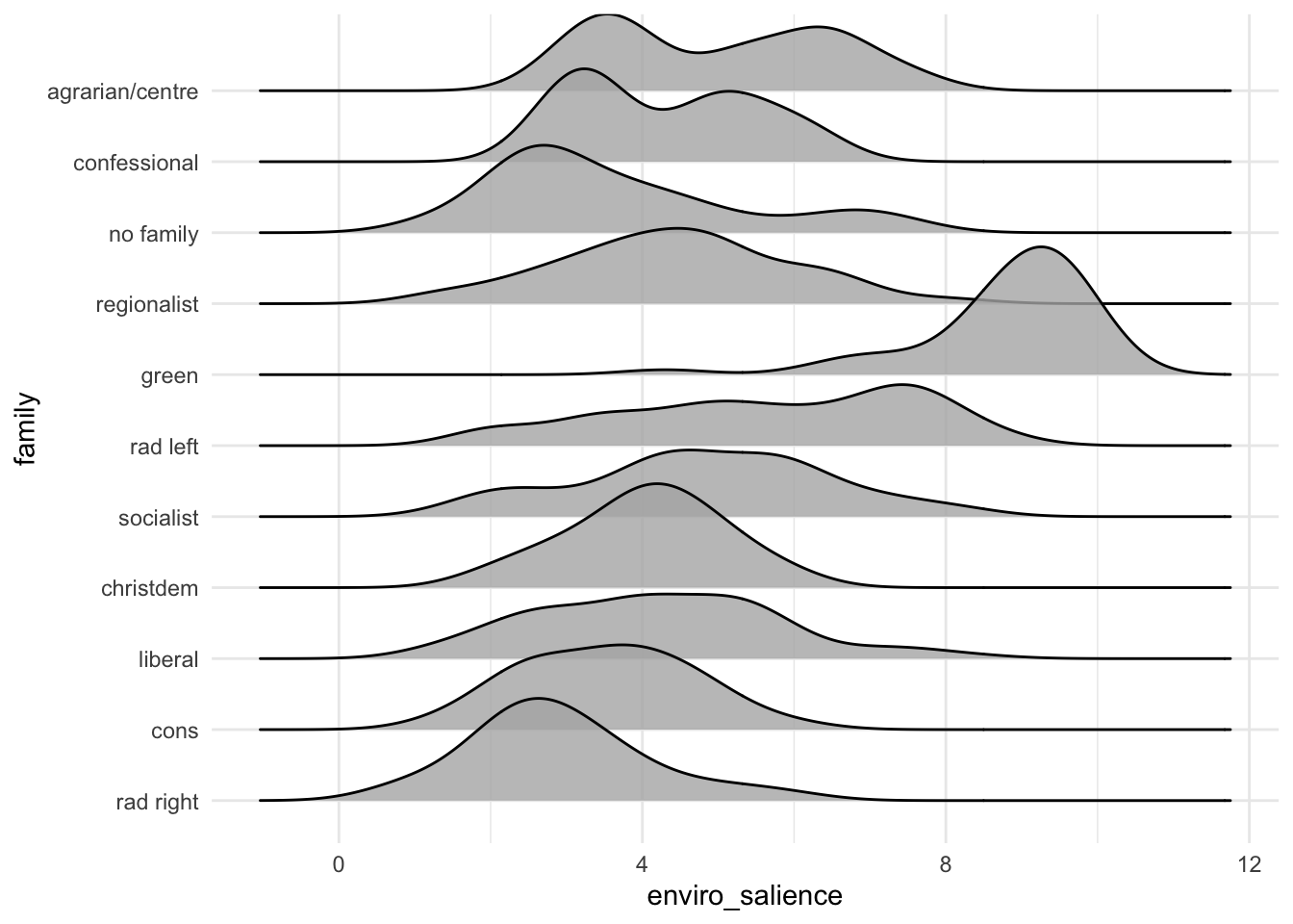
Most of the time, we are interested to see how variables are distributed across groups. To do so with a histogram or a density plot, we wan use the fill argument to have different colors for each group of a given variable.
10.6 Plotting the evolution of eu positions over time
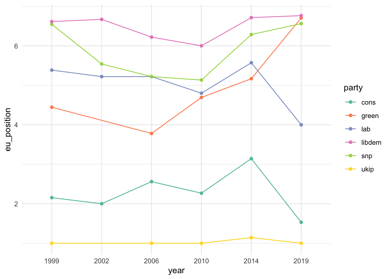
view(ches) ches |>mutate(party =str_to_lower(party)) |>filter(country =="uk", party %in%c("cons", "ukip", "snp", "green", "libdem", "lab")) |>ggplot(aes(x = year, y = eu_position, color = party, group = party)) +geom_point() +geom_line() +scale_color_brewer(palette ="Set2") +theme_minimal()
10.7 Scatter plots : relationships between two continuous variables
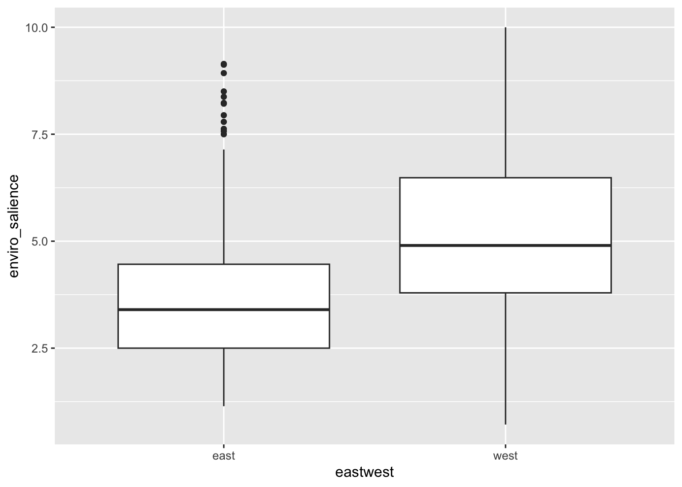
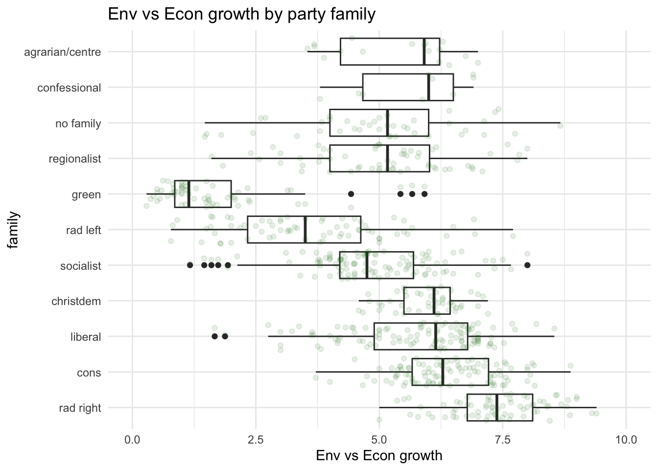
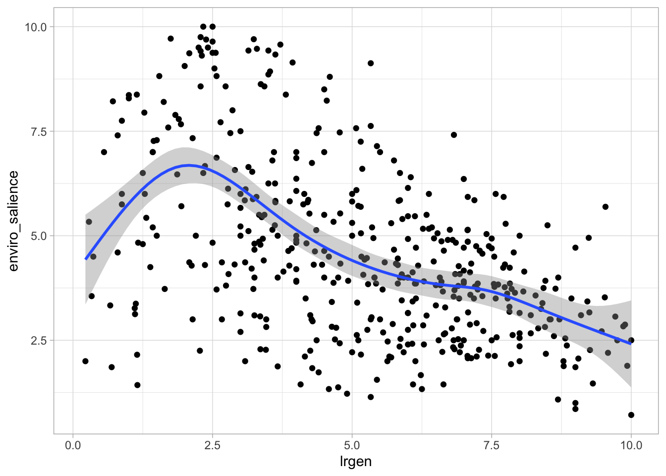
So far, we have plotted the values of environental salience across categorical variables such as party families or the division east west. We have noticed that party families that are on the right are usually less pro-environment than families that are on the left. We could also visualise this by looking at the association of environmental_salience with the lrgen variable that place political parties on the left right scale.
# Are left right positions and environmental salience related ? ches |>ggplot(aes(x = lrgen, y = enviro_salience)) +geom_point() +geom_smooth() +theme_light()
`geom_smooth()` using method = 'gam' and formula = 'y ~ s(x, bs = "cs")'
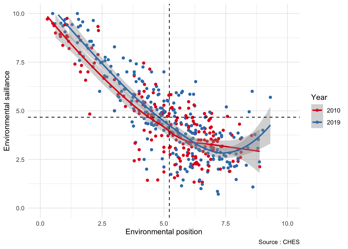
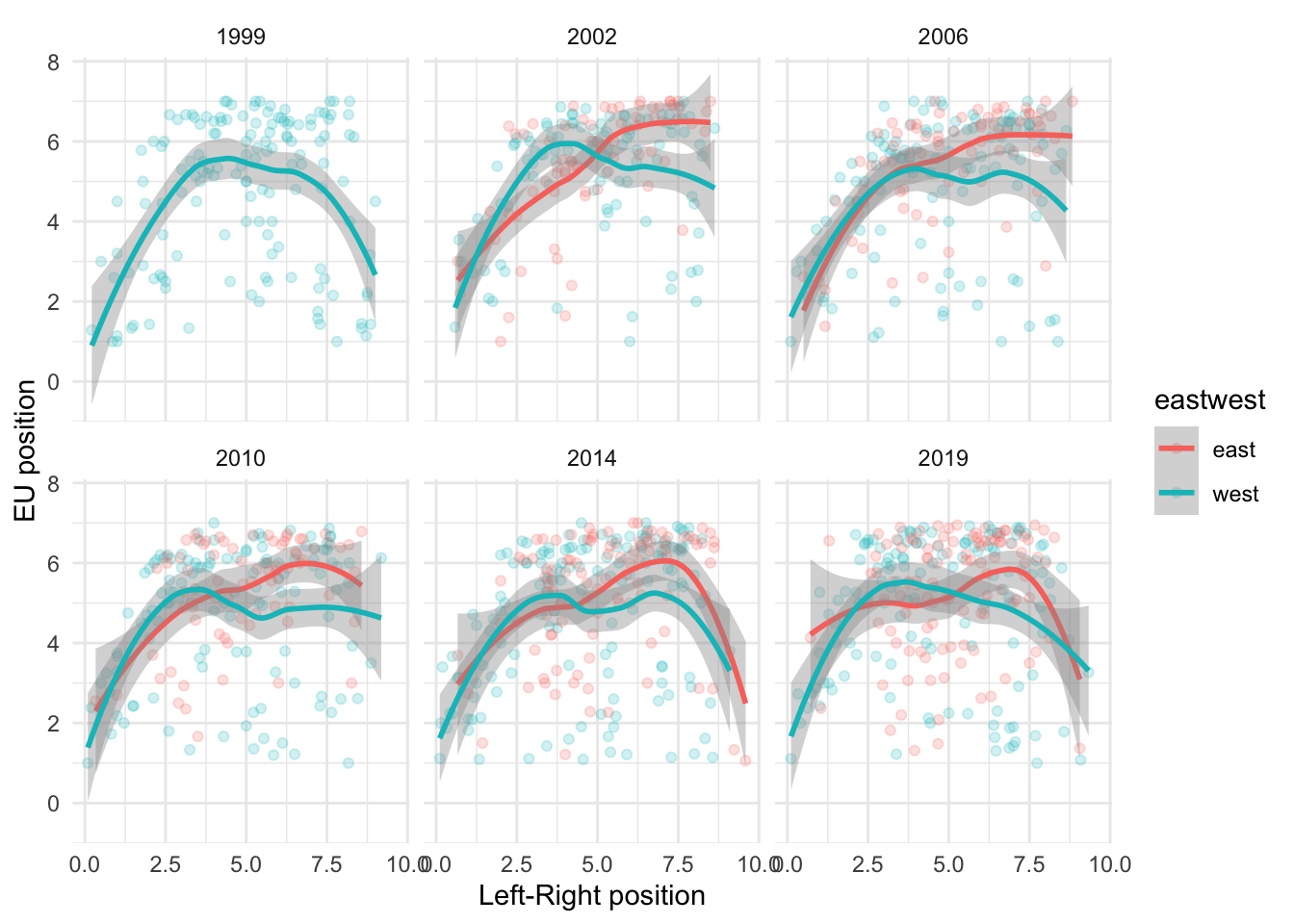
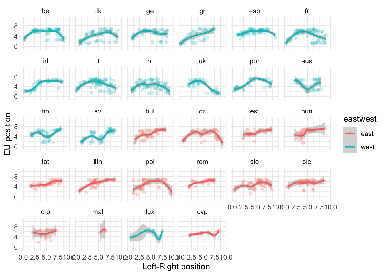
One of the pattern identified in the literature is the so-called U-curve relationship between the left right economic placement of a party and its position towards the EU.
`geom_smooth()` using method = 'loess' and formula = 'y ~ x'
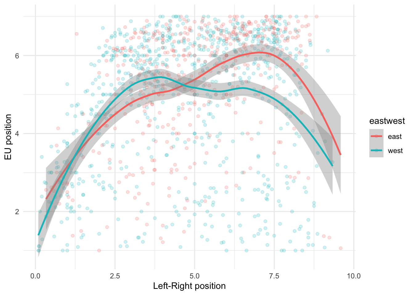
To compare this relationship across many different categories, it is usually easier to use facetting with facet_wrap().
eu_plot +facet_wrap(~ year)
`geom_smooth()` using method = 'loess' and formula = 'y ~ x'
eu_plot +facet_wrap(~ country)
`geom_smooth()` using method = 'loess' and formula = 'y ~ x'
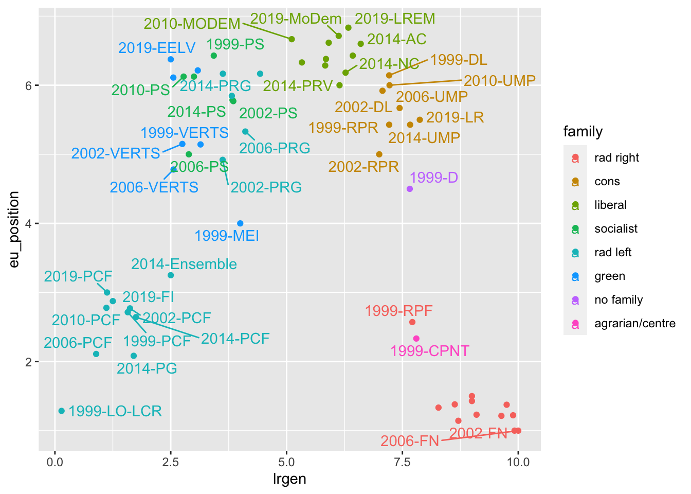
10.9 Adding annotations with ggrepel()
ches |># Keep only french observationsfilter(country =="fr") |># Create a party-year variable by combining the text of bothmutate(party_year =str_c(year, "-", party)) |>ggplot(aes(lrgen, eu_position, color = family, label = party_year)) +geom_point() + ggrepel::geom_text_repel()
Warning: ggrepel: 19 unlabeled data points (too many overlaps). Consider
increasing max.overlaps
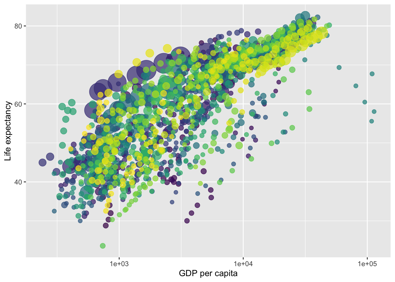
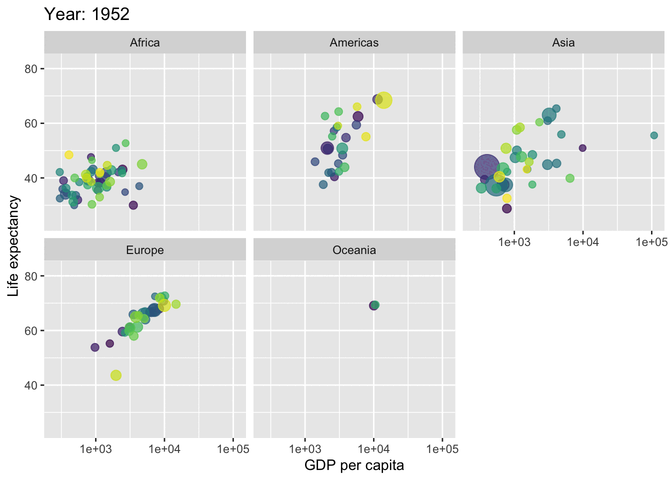
You can also animate your graphs : here an exemple coming from the gapminder dataset (not parties animore) that plot the evolution over time of the relationship between the gdp per capita and life expectancy across different continents.
needs(gapminder)p <-ggplot(gapminder,aes(x = gdpPercap,y = lifeExp,size = pop,colour = country )) +geom_point(show.legend =FALSE, alpha =0.7) +scale_color_viridis_d() +scale_size(range =c(2, 12)) +scale_x_log10() +labs(x ="GDP per capita", y ="Life expectancy")p
p +facet_wrap(~continent) +transition_time(year) +labs(title ="Year: {frame_time}")