Todays focus is on measuring the relationship between two continuous variables. To do so, we will first look at how to do correlations. Then, we will look at how to perform linear regression.
13.1 A brief reminder on correlation
A correlation is a statistical measure that expresses the extent to which two variables are linearly related. A correlation coefficient measures the strength and direction of a linear relationship between two variables. It quantifies how changes in one variable correspond to changes in another variable. The correlation coefficient ranges between -1 and 1, where -1 indicates a perfect negative linear relationship, 1 indicates a perfect positive linear relationship, and 0 indicates no linear relationship.
Correlations coefficients give you a indicator of the intensity of the relationships between two continuous variables.
13.2 Performing correlations in R
To explore correlations, we will work on affective polarization in France. Affective polarization is a really trendy topic in political science. The concept relates to how much people of some (political) groups tend to like or dislike each other. Here, we will use data from the french electoral study conducted during the campaing of the last presidential election and asking to each respondent to what extent they have sympathy for the people who vote for each party. We want to look at which groups of party supporters tend to be liked or dislike together.
The information we are interested in is contained in the variables from fes3_QA07_A to fes3_QA07_G. These variables contain the responses of the participants to the question, ‘On a scale from 0 to 10, how much sympathy do you have for people who vote for [PARTY NAME]?’ We have variables for 6 different parties: LFI, EELV, PS, LREM, LR, RN, and REC. The responses are coded from 0 to 10, with 0 indicating ‘no sympathy at all’ and 10 indicating ‘a lot of sympathy.’ We will first rename and recode these variables to make them more user-friendly.
fes2022 <- fes2022 |># Rename each variabe by prefix symp_ + party namerename(symp_fi = fes3_QA07_A,symp_eelv = fes3_QA07_B,symp_ps = fes3_QA07_C,symp_lrem = fes3_QA07_D,symp_lr = fes3_QA07_E,symp_rn = fes3_QA07_F,symp_re = fes3_QA07_G ) |># Recode the 7 variables at once by replacing missing values with 5mutate_at(# Specify which variables we want to change : those starting with "symp"vars(starts_with("symp")), # For each of those variable, when a value is between 0 and 10, keep it, otherwise replace it with 5~case_when(.x %in%c(0:10) ~ .x, .default =5))fes2022 |>count(symp_eelv)
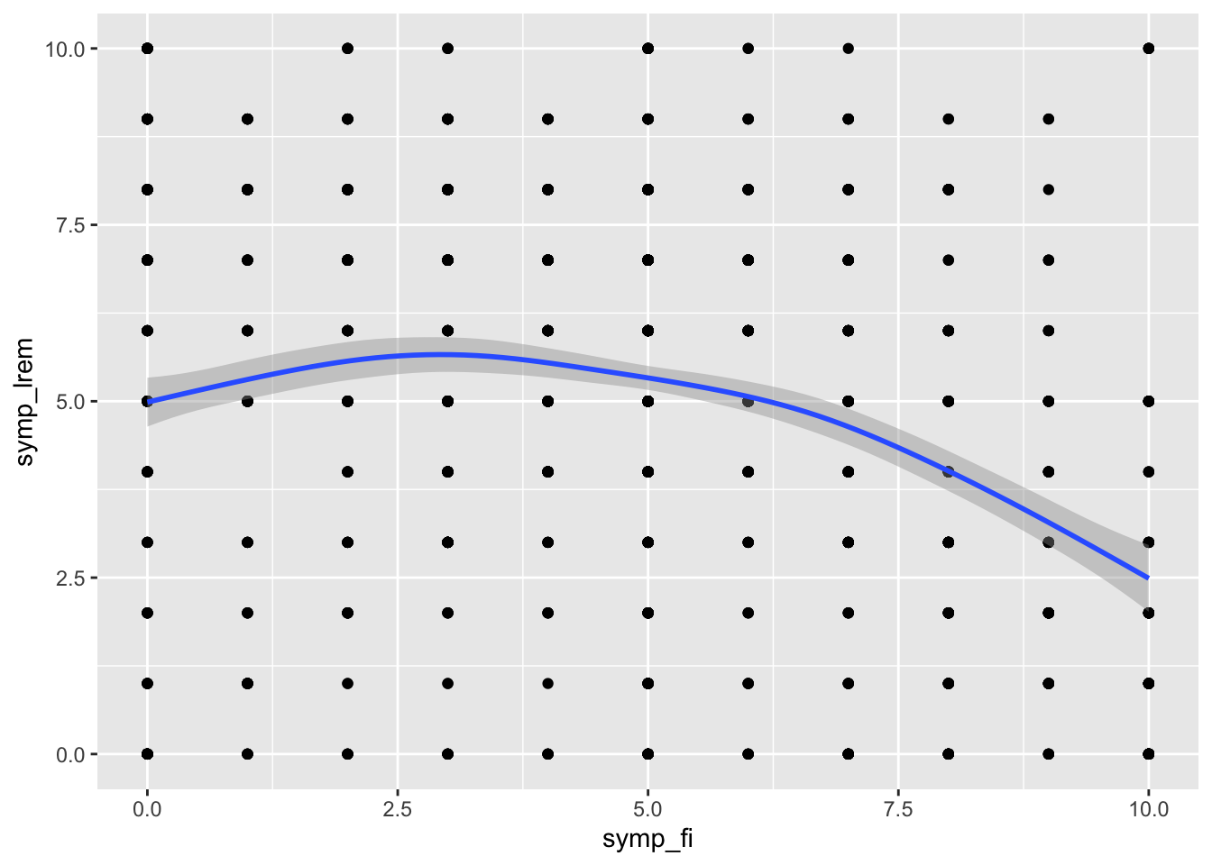
Now, we do not have any missing values in all of those variables. We will start by looking at the relationship between sympathy for LFI and sympathy for LREM. We will use the cor() function to compute the correlation between the two variables. Note that in the case we have missing values in our data, the cor function will not work. In that case, you can add use = "complete.obs" as argument in the cor()function.
Here we see that the relationship is negative, meaning that people who have sympathy for LFI tend to have less sympathy for LREM.
# Standard way to compute a correlation in Rcor(fes2022$symp_fi, fes2022$symp_lrem)
[1] -0.2126489
We will also use the cor.test() function to test whether the correlation is statistically significant.
When looking at relationships between variables, it is always a good idea to visualize the data. Here, we will use a scatterplot to visualize the relationship between sympathy for LFI and sympathy for LREM. We will use the ggplot2 package to do so.
13.2.1 Multiple correlation with the corrr package
Sometimes, we are not interested in the correlation of two variables but of many at the same time. To do this, we compute correlation matrices, which can be done with the cor() function that we have seen above. But, the corrr package comes with super handy functions to obtain, manipulate and visualize the results of correlations. You will need first to install the package and load it.
I first create a subset of my dataset with only the variables measuring affective polarization towards different groups of voters.
# A tibble: 7 × 8
  term      symp_fi symp_eelv symp_ps symp_lrem symp_lr symp_rn symp_re
  <chr>       <dbl>     <dbl>   <dbl>     <dbl>   <dbl>   <dbl>   <dbl>
1 symp_fi    NA        0.563   0.507    -0.213  -0.270   -0.193  -0.182
2 symp_eelv   0.563   NA       0.620     0.0917 -0.0987  -0.315  -0.321
3 symp_ps     0.507    0.620  NA         0.188  -0.0440  -0.339  -0.303
4 symp_lrem  -0.213    0.0917  0.188    NA       0.522   -0.161  -0.148
5 symp_lr    -0.270   -0.0987 -0.0440    0.522  NA        0.271   0.256
6 symp_rn    -0.193   -0.315  -0.339    -0.161   0.271   NA       0.769
7 symp_re    -0.182   -0.321  -0.303    -0.148   0.256    0.769  NA
To make this more readable, we can also use the following to get the variables that are the most correlated with each others.
(affect_df <- affect_matrix |># Keep only the upper triangle of the matrixshave() |># Transform the matrix into a dataframe of 3 columns : var1, var2, correlationstretch(na.rm = T))
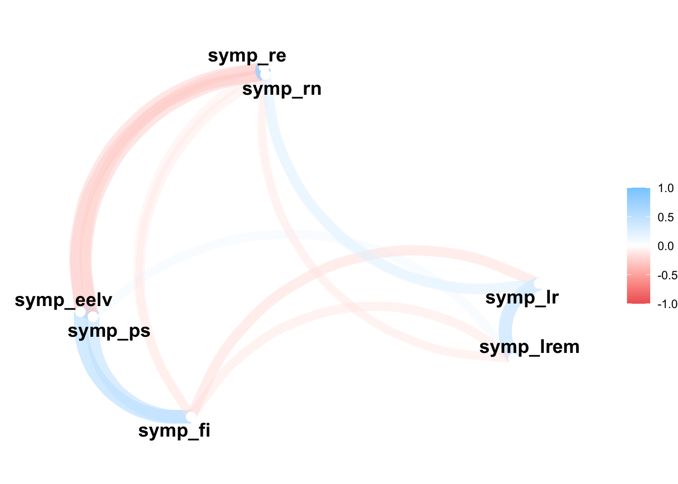
We see for instance here that the variables measuring affective polarization towards the RN and Reconquête are the most positively correlated. This means that people having sympathy for people voting for one of this party tend to have sympathy for people voting for the other party.
affect_df |># Order the dataframe by correlation from 1 to -1arrange(-r)
On the other hand, we see that the variables measuring affective polarization towards the PS and the RN are the most negatively correlated. This means that people having sympathy for people voting for one of this party tend to have antipathy for people voting for the other party. However, the relationship is not as strong as the one between the RN and Reconquête.
affect_df |># Order the dataframe by correlation from - 1 to 1arrange(r)
Calculating a correlation test for each pairwise correlation is a bit trickier but here an example of how you could proceed. We create first a function that will calculate a test between two variables and then we use the colpair_map() function on our dataset to calculate all the tests. We then filter the results to keep only the non-significant results.
# Create function to calculate a correlation test between two variables and extract the p-valuecalc_cor_test <-function(var_1, var_2) {cor.test(var_1, var_2)$p.value}cor.test(fes2022$symp_eelv, fes2022$symp_fi)
    Pearson's product-moment correlation

data:  fes2022$symp_eelv and fes2022$symp_fi
t = 27.358, df = 1612, p-value < 2.2e-16
alternative hypothesis: true correlation is not equal to 0
95 percent confidence interval:
 0.5288387 0.5955318
sample estimates:
      cor
0.5631015
# For each pair of variables, calculate the correlation test(tests <-colpair_map(fes_affect, calc_cor_test))
tests |># Keep only the upper triangle of the matrixshave() |># Transform the matrix into a dataframe of 3 columns : var1, var2, correlationstretch(na.rm = T) |># Add a column with a TRUE/FALSE value depending on whether the p-value is below 0.05mutate(significant = r <0.05) |># Keep only the non-significant resultsfilter(significant ==FALSE)
# A tibble: 1 × 4
  x       y            r significant
  <chr>   <chr>    <dbl> <lgl>
1 symp_ps symp_lr 0.0769 FALSE
The only correlation that is not significant in our test is between the socialist party and republican. That means that there is no significant relationship between how people like or dislike those who vote for the Republicans and for the socialist party.
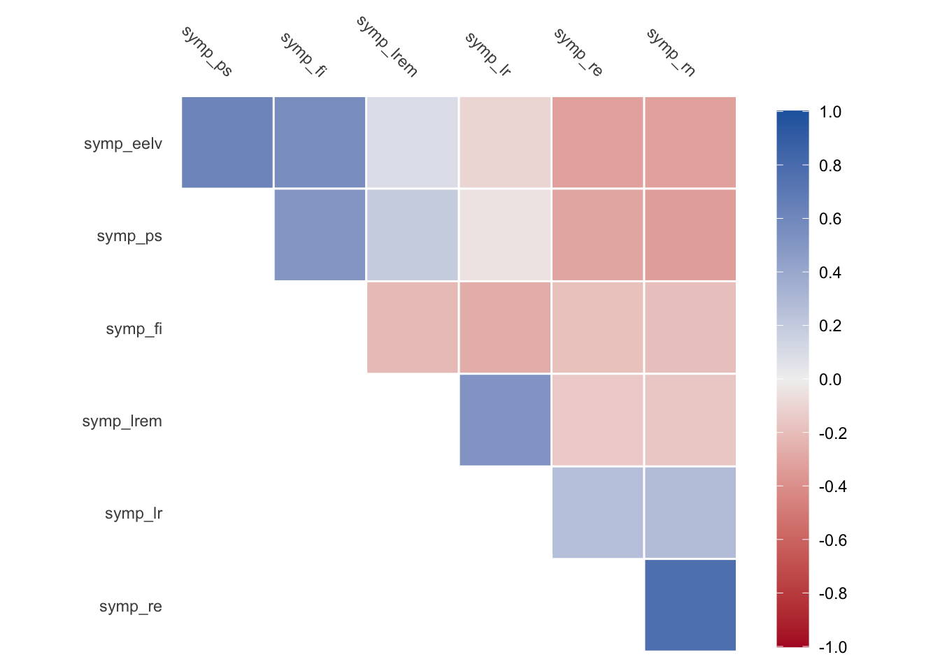
We can also visualize the correlations either with a heatmap or with a network plot.
# Heatmapaffect_matrix |>autoplot()
# Network plotaffect_matrix |>network_plot(0.1)
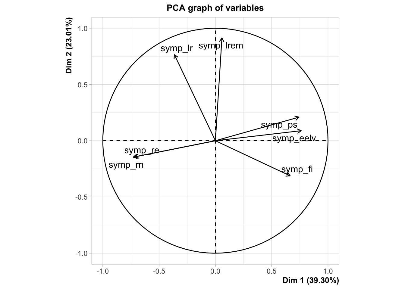
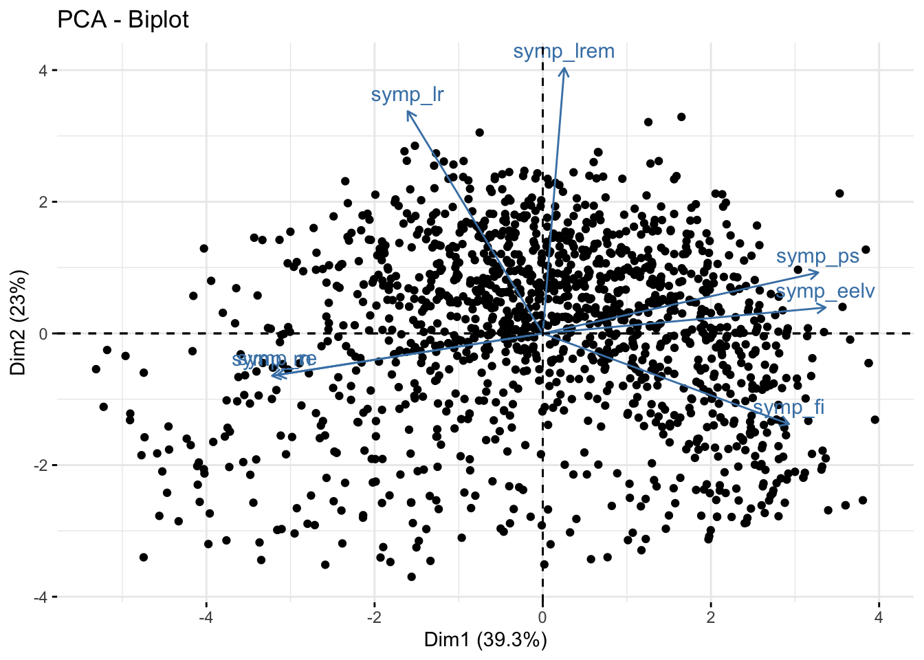
13.3 A short introduction to PCA
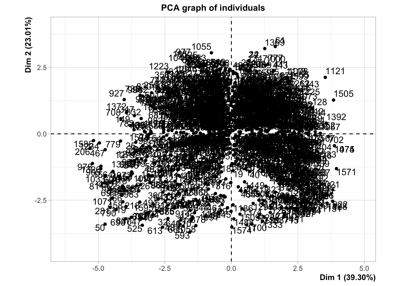
Measuring the correlation of multiples variables is useful when we want to reduce the number of variables in our dataset and find out which variables are the most correlated with each others. To do so, we can use a technique called Principal Component Analysis (PCA) which is a dimensionality reduction technique. Basically, it allows us to reduce the number of variables in our dataset by creating new variables that are linear combinations of the original variables. The new variables are called principal components. The first principal component is the one that explains the most variance in the data. The second principal component is the one that explains the second most variance in the data, and so on. I am not going to go into the details of how PCA works but if you want to learn more about it, you can check out this video or this article. Here, I just show you an exemple of a PCA on all of our variables measuring affective polarization.
# Install/Load the two packages I will use for the PCAneeds(FactoMineR, factoextra)pca_fes <- fes2022 |># Select only the variables measuring affective polarizationselect(starts_with("symp")) |># Perform the PCAPCA()
# Visualize both the variables and the individuals on the first two principal components fviz_pca_biplot(pca_fes, label ="var", ggtheme =theme_minimal())